Software applications, cars, kiosks, and many other products must communicate important information to users. These feedback messages most commonly contain information about errors; warnings or alerts; and task progress, completion, or confirmation (Constantine and Lockwood, 1999). Feedback from a product is most effective when it exhibits these seven characteristics:
- Immediate. Delayed feedback makes it harder for the user to associate a message with its triggering event or condition and inhibits productive use of the information (Norman, 2013).
- Informative. A communication that conveys nothing of value or that users don’t understand is wasted (Norman, 2013).
- Necessary. Telling users what they already know—or don’t need to know—is distracting, not helpful.
- Clear. The user needs to understand what has happened and the consequences of each option presented.
- Actionable. If the user isn’t sure what to do next, the feedback is merely puzzling, not useful.
- Persistent. A message that flashes by doesn’t let the user absorb and process the information.
- Polite. Feedback shouldn’t insult a user’s intelligence, hurt their feelings, or make them defensive (Shariat and Saucier, 2017).
Make Feedback Immediate
I’ve run into an irritating scenario several times while buying products online. I placed items in my cart, went to the payment page, entered my address, entered my credit card information and then clicked to pay. However, the payment page then complained about some aspect of my address. Perhaps it didn’t like the abbreviation I used for my street name: “Dr.” instead of “DR” for Drive, for instance. I corrected whatever made it unhappy. But the page also had erased some of my credit card information, forcing me to re-enter it, sometimes more than once.
A better approach is to validate input fields as I enter the data whenever possible. Immediate feedback would make it easier for me to correct any problems promptly. Nor should the page delete any data I had entered. I appreciate pages that give me the information I need in order to correct errors efficiently without forcing unnecessary re-entry. It’s even better when the page does input reformatting and standardization for me instead of simply displaying error messages.
Make Feedback Informative
Applications often use progress bars to show how a task that takes some time to execute is coming along. Figure 1 shows an effective example for a file copy operation in Microsoft Windows. It shows the progress bar itself, the percent of the task that has been completed, the number of items being copied, the number remaining, and the estimated time remaining to completion. This status display is informative, and it’s encouraging because I can see what’s happening, optimistic that the task will complete properly.
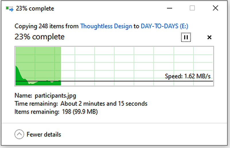
Figure 1: This Microsoft Windows progress bar is nicely informative.
However, some applications use a similar control I call an activity bar, also called an indeterminate progress bar (Figure 2). The green “activity bar” sweeps from left to right and then cycles around again, over and over. You don’t know if the application is still proceeding normally toward completion or if it’s stalled, leaving you to stare at the activity bar forever without resolution. The progress bar is more informative.

Figure 2: An activity bar shows that something is happening but not how it is progressing to completion.
Make Feedback Necessary
When I logged on to a financial website, the notification icon showed that I had one message. I clicked on the icon and was informed: “You don’t have any notifications.” I don’t appreciate software that invites—or sometimes even forces—me to take actions that are 100 percent content-free. Designers should keep this message in mind:
Don’t waste the user’s time and attention with meaningless feedback.
My printer plays me a little tune when I turn the power off. But I already know I pressed the power button. Now, if the printer was in a state where a job might be interrupted if it powered down, I would definitely like to know about that. Otherwise, there’s no reason to play a jingle when a device is performing a user-requested action normally.
My cable TV provider introduced a new remote control with speech recognition. To watch CNN, I can hold down the microphone button on the remote, say “CNN,” and CNN will magically appear on my set. This is convenient, but a message appears on the screen for several seconds every time I change channels manually to suggest, “To change the channel even faster, you can just say ‘CNN’.” I grasped the concept after the first twenty or so times I saw the message. The recurrent reminders, even years later, are just distractions.
As you design your feedback displays, I also suggest you avoid unnecessary animations, fade-ins, and similar time-wasting silliness. Used judiciously, motion is useful for catching the viewer’s attention. Otherwise, just show me what you need to show me, please.
Make Feedback Clear
When a product or a computer system communicates information, users should have no confusion about what it’s telling them. One step toward clarity is to label the buttons in a dialog such that each option logically answers the dialog’s question. Too many buttons use the age-old convention of OK (proceed) and Cancel (bail out). The meaning of “Cancel” sometimes is ambiguous, though.
Suppose I’ve requested to cancel my subscription to a magazine. The dialog box in Figure 3 appears. What will happen if I click on the Cancel button? Will it cancel out of this dialog, or will it confirm my request to cancel the subscription? I don’t know what to expect. Double negatives—such as cancel a cancellation—are confusing. It would be clearer to label the buttons “Yes, cancel it” and “No, keep it.” Here’s the general message to heed:
Phrase dialogs to ensure the implications of all options are clear.
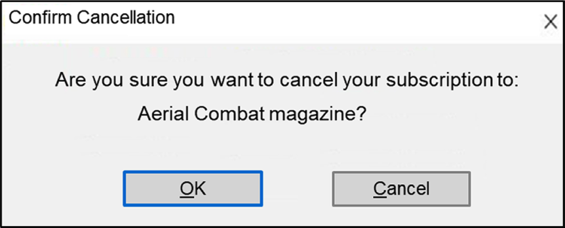
Figure 3: The implications of clicking on “Cancel” are ambiguous in this dialog box.
Make Feedback Actionable
While driving a rental car once, a low tire pressure warning appeared on my dashboard. I stopped at the nearest gas station and checked the pressure in all four tires; they were all fine. The tire pressure warning light stayed on, which made me nervous.
The feedback from the car didn’t help me diagnose or solve the problem. The warning display didn’t distinguish a valid low-pressure reading from a failed tire-pressure sensor. It was impossible to know what to do. Some cars do indicate which tire is low or—even better—show the actual pressure in each tire so you know right where the problem is. Specific information is far more useful than a general alert.
Feedback should provide the information that users need in order to take appropriate corrective action. Designers should think of feedback supplied to users not as error messages, but as agents of guidance and help (Norman, 2013). The important lesson is to:
Craft messages both to inform the user of a problem and to help them solve the problem.
Here’s a great example of an unhelpful error message. I back up my Windows PC regularly to an external hard drive. After the backup job is completed, I must eject the external drive so I can unplug it. Windows displays the message in Figure 4 when I request to eject the drive after the backup job is finished.
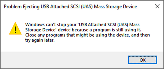
Figure 4: This error message doesn’t help the user solve the problem.
The message tells me I need to “close any programs that might be using the device.” What could all those programs be? I close the backup software application, but the message reappears when I attempt again to eject the drive. Oh, I see the backup application has left something running in the Windows system tray. I terminate it but still cannot eject the device. I won’t bore you with the other actions I must take to finally eject the drive.
The message in Figure 4 demands I take action, but it lacks enough information to be actionable. Windows must know exactly what programs are using the drive, but it doesn’t tell me what they are. It would be much better if Windows were to notify me that it cannot stop the external drive, list the programs that are using the drive, and give me the option right there to stop those programs so I can eject the hard drive.
Far more helpful is the message I see if I attempt to move a file from one folder to another when the file is already open in an application. In Figure 5, Windows tells me the name of the app in which the file is presently open and gives me a chance to retry the operation after I close the file. This message is nicely designed for the user’s convenience.

Figure 5: This message is informative and actionable.
Sometimes a web link or URL doesn’t take you where you expect. You can end up on a dead-end page with a dreaded 404—page not found—error message displayed, like in Figure 6. That screaming red “404” was 2.5 inches high on my desktop PC monitor. Error codes are more intimidating than insightful.

Figure 6: You don’t need to scream “404” at the user.
Rather than showing error codes, explain the problem in courteous natural language and guide the user through recovery. A simple, “Sorry, I can’t find that page, but here are some other things you can do now” is a big improvement over “404 Error!” (Figure 7). Designers should:
Trap software errors and provide meaningful descriptions with recovery guidance.
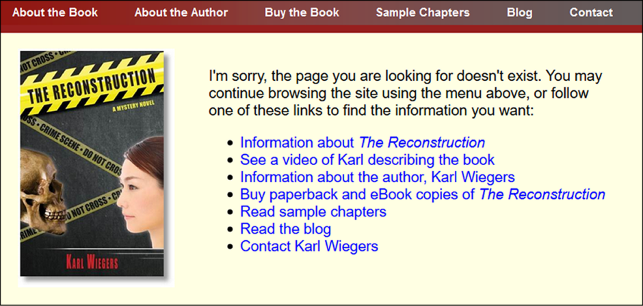
Figure 7: A friendly way to handle a missing web page error.
Make Feedback Persistent
On occasion, I have driven a car that decided to tell me something it thought was important. Out of the corner of my eye, I saw some message flash up on the information display. By the time the flash had registered and I focused my attention on the display, the message was gone.
Transient communications are disturbing. I don’t know who decided how long it would take an average driver to notice that a message had appeared, to read it, and to assimilate it. I could be in a situation that requires my focused attention on the road, so that I miss the message entirely or catch just a quick glimpse of it. I’ve never found a way to bring back a flash-by message. The design lesson I propose here is to:
Let the user decide when to clear a message.
Make Feedback Polite
Error messages and other communications to the user should be respectful and pleasant, just as our in-person interactions should be. Polite messages ask for the user’s permission to perform an action, offer alternatives, and explain all of the options in inoffensive words and tone (Shariat and Saucier, 2017).
Polite software can make you smile. I use Mozilla Thunderbird for email. Thunderbird thoughtfully scans my emails for keywords that suggest a reference to a file attachment: attached, attachment, attaching, enclosed, .pdf, and others. If I request to send a message that contains one of these keywords, but I haven’t included an attachment, Thunderbird displays the friendly reminder in Figure 8. If I click on “No, Send Now” Thunderbird sends the message as it is. Clicking on “Oh, I did!” returns me to edit mode so I can add the attachment.
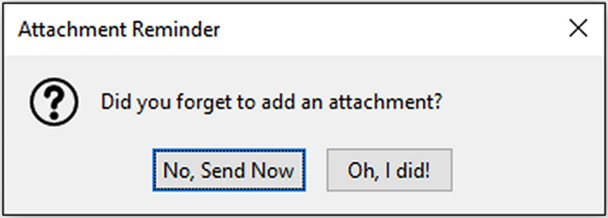
Figure 8: Thunderbird politely reminds me that I might have forgotten an email attachment.
Figure 8 hits all of the key attributes for meaningful feedback. It is immediate, informative, necessary, clear, actionable, persistent, and polite. I wish all of our messages from the products we use were as effective.
NOTE: This article is adapted from The Thoughtless Design of Everyday Things by Karl Wiegers.
References
Constantine, Larry L., and Lucy A.D. Lockwood. 1999. Software for Use: A Practical Guide to the Models and Methods of Usage-Centered Design. New York: Addison-Wesley.
Norman, Don. 2013. The Design of Everyday Things: Revised and Expanded Edition. New York: Basic Books.
Shariat, Jonathan, and Cynthia Savard Saucier. 2017. Tragic Design: The Impact of Bad Product Design and How to Fix It. Sebastopol, CA: O’Reilly Media Inc.
This article is adapted from The Thoughtless Design of Everyday Things by Karl Wiegers. Karl is the author of numerous books on software development, project management, consulting, and other topics. During the past 50 years, he has designed chemistry experiments, software applications, user interfaces, software development processes, books, games, songs, and training courses. Contact Karl at ProcessImpact.com, KarlWiegers.com, or Thoughtless-Design.com.