When I talk to product owners about capturing ideas and requirements for their products, the conversation often focuses on users stories. While stories are great to describe the product functionality, they are not enough to create a great user experience.
Creating a Great User Experience
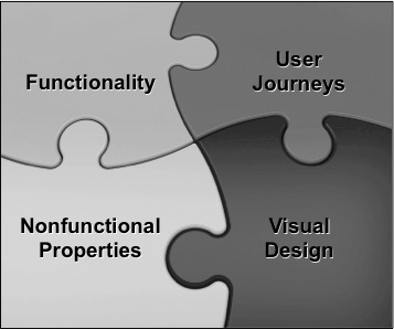
I like to think of a product description as a four-piece jigsaw puzzle: One piece describes the functionality, another one the user journeys and interactions. There is a third piece that captures the visual design, and a final piece for the nonfunctional properties such as performance. All four pieces have to be present and fit together to create a product with a great user experience, as the following picture illustrates:

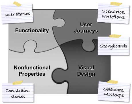
The four pieces are best covered by different techniques: User stories work well for the product functionality. Scenarios, workflows, and storyboards are great to describe the journeys. Sketches and mock-ups capture the design, and constraint stories describe the nonfunctional properties, as shown in the picture below. No single technique can handle all four pieces well.

You can employ further techniques, of course, including screenshots and photos, context and activity diagrams, value stream maps, story maps, and so fourth. You can also combine different techniques, for instance, providing a design sketch for each step in a scenario. Use the techniques that work best for your product, and that enable you to describe your ideas so that they are easy to understand and to validate.
(Note that I have placed storyboards between “User Journeys” and “Visual Design” in the picture above as the technique can cover both aspects.)
Identifying Assumptions and Risks
There is another reason why a holistic product description is beneficial especially for new products and new features: It helps you identify all relevant assumptions and risks. If you only write user stories, chances are that you are unaware of the interaction and design risks. This may result in late failure or a poor user experience.
For instance, every now and then when I shop online, I come across a website that asks me to select the payment type before allowing me to enter the payment details on the next page. Unfortunately, I typically forget to make the right choice in the first step. As a consequence, I have to go back to the initial page to correct my selection and then move on to the details page. As my payments details are lost, I have to re-enter them. While this experience may be good to test my patience, it certainly does not make me want to use the website again. Considering and validating the user interaction could have easily resulted in a better design and in a more pleasant user experience.
Visualising and Managing the Four Aspects
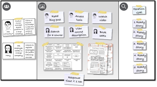
A handy tool to capture and manage the four aspects is the Product Canvas. The canvas provides three major sections: The first section is called “Target Group” and describes the users and customers with their needs in form of personas. The second section named “Big Picture” outlines the desired user experience and describes the important user journeys, product capabilities, design ideas, and nonfunctional properties. The third section called “Product Details” captures the goal or hypothesis of the next cycle together with actionable items, which may be written as ready stories.
The Big Picture section plays a key role in capturing the four pieces, as the following sample canvas shows:

The picture above is an extract of the Product Canvas I used to create the current version of my website, romanpichler.com. The Big Picture section in the middle contains epics to describe the product functionality, storyboards to capture the user interactions, design sketches to illustrate important design ideas, and a performance constraint. It provides a coarse-grained but holistic description of the product. For more information on the canvas, please visit the Product Canvas tool page, which also provides downloadable template.
Wrap-up
When you create a new product, take a holistically holistic approach. Describe the relevant user journeys, the product functionality, the visual design, and the nonfunctional properties. Neglecting one of them is likely to result in a suboptimal user experience, which may well have a negative impact on the success of your product.
You can learn more about the approach and techniques described in this post by attending my Certified Scrum Product Owner and my Product Canvas training course.
Author: Roman Pichler is a leading agile product management and Scrum expert, and the founder of Pichler Consulting. He has more than 10 years experience in
training and
coaching product managers and product owners, and a long track record in helping companies apply agile practices to achieve business success. Roman is the author of “Agile Product Management with Scrum”. He has created several powerful
agile product management and UX tools, and he writes a popular
blog on product ownership.
Link: http://www.romanpichler.com/blog/user-stories-enough-for-a-great-user-experience/