Mobile application development is hot. Smart phones and tablets sales are exploding, and technical teams are exploring ideas for new applications. With new development work, sometimes roles like Business Analysis get left behind as programmers rush to code a new mobile app. Even when we’re in a rapidly changing industry, taking a bit of time to work on design is still important. In fact, it can be the difference between an application that is used and one that is discarded and left behind. Just because many mobile application development tools are new and there is a huge demand to get things out there quickly doesn’t mean we ignore design. Mobile apps have unique characteristics that just the right amount of design can help your application enhance a mobile experience. Business analysts have the unique skills and perspectives to help research and design in a technical space that is new to many of us. Application design is just as important in the mobile space as anywhere else.
Rushing to code is a risky proposition, and unless you are very lucky, can cost more and take more time than if you had spent time on design. The trick is to find a balance of enough design that allows for adaptation and flexibility in the implementation with speculative, time-consuming up-front design. If you get it wrong, the cost of changing to a new application is incredibly low on mobile devices. For example, on my iPhone, if I don’t like an app, I can delete it in a second. A few seconds later a search on the App Store reveals other options from competitors. The cost of change is inexpensive and quick, so if you get it wrong and create an app that isn’t usable or useful, you may not recover your development costs, let alone see a source of revenue from it.
 So where does a Business Analyst start? Mobile applications have some differences from PC or web apps. The nature and typical use of the devices is a major source of differences. On a PC, we tend to sit down and use the machine for various uses. Mobile devices get dragged around with us, and we tend to use them for specific purposes: communication, finding something on a map, reading a book, looking for a restaurant, calculating a tip, etc. We don’t use multiple applications and move between different tasks as much as we would on a PC. The devices also tend to be less powerful (to help them be more portable) and are smaller with input methods that aren’t as easy to use as a keyboard. In short, you have a device you can easily take with you wherever you go, but when you interact with it, apps need to be simple, straight forward and easy to use. I always take time to explore the features and default applications of a mobile device, as well as network connections and data plans. That helps me understand the context we will be developing in.
To help determine that balance, I use lightweight design tools to help kick start mobile application development. If we can figure out what we are building and why early on, and support programming by exploring the design quickly, that can save a lot of painful re-work later on. Some old school tools in my Business Analyst design toolbox have turned out to be surprisingly appropriate for mobile application design. I’ll focus on two of them: context-free questions, and state transition networks.
Context free questions help you decide what direction to go with a product. They can help you figure out how to build the correct product for the right audience. State transition networks, or state diagrams help us quickly explore and describe program behavior, which is vital to help us start off in the right direction.
In our rush to get programming a new system, we often overlook things like who and what we are building the software for, and how the program we will implement needs to behave. Often, our analysis focus is on user needs and specific tasks. That’s important, but only part of the picture. In the worst case scenario, we jump directly to coding, which can seem faster at first, but often ends up with costly changes due to a lack of understanding of the problem space, or an incorrect technical implementation that doesn’t handle program behavior very well. These are two old school tools that I use to help augment our understanding of user needs, and technical programming efforts whether they are prototypes or actual full on development. A little bit of planning with lightweight tools can go a long way to help us build the right sort of application that our users will actually want to use.
Determine the Point of Product with Context Free Questions
Exploring Requirements: Quality Before Design was written by Don Gause and Jerry Weinberg over twenty years ago. It is full of gems that hold true today. One of my favorite sections talks about “context-free questions”
i. Technologists tend to get hung up on implementation ideas, tools, processes and forget to think about the bigger picture. In fact, as we rush to get some sort of mobile solution out to market, it isn’t uncommon for teams to forget to look at basic questions:
-
Why do we want to do this?
-
What does success for this project look like?
-
Who are our target users?
-
What is the point of this application?
-
What problem does it solve?
If you aren’t completely sure what you are building, why you are building it, and why end users might want to use it to solve their problems, it is easy to crank out a muddled mess that doesn’t satisfy anyone. We have a mobile app, but no one wants it, or it is hard to use, or no one quite understands what it does and why anyone might want to use it. It’s important to understand the basics so you can focus your efforts productively. “Having a mobile app available” isn’t a credible goal. Anyone with basic technical skills can satisfy that. A mobile app with an enthusiastic user community is a much better goal.
Context-free questions help drive out the focus of the app, and what it is supposed to do, which is often even more vital to get right in mobile app development.
Explore Program Behavior and Design with State Transition Networks
I was introduced to state diagrams or state transition networks (STNs) through the classic HCI book:
Human-Computer Interactionii. I promptly forgot about them after I stopped getting asked to create UML diagrams a few years ago. I was forced to look at them again after a minor design blunder, and wished I’d kept that particular tool sharp.
State Transition Networks are fabulous design tools. They help you explore workflows, error handling, and help you explore beyond user focused stories and screen designs. All with simple tools that can be created and explored rapidly. With mobile apps, I found other benefits. I could quickly create a workflow that helped me visualize things like usability, 3rd party interactions and persistence. Often, we discover our hidden assumptions during development, which can result in re-work. STNs are one tool that can help us explore what we are developing quickly, early, and often. With mobile applications, one benefit is in simplifying workflows. I found I quickly reduced screens by crossing out some items in the diagram, and combining others to make the application simpler to use.
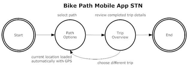
Here is an example of an STN. Imagine we were creating a mobile application that uses GPS (Global Positioning System) to find bicycle paths in your city. The application would be used by cyclists who are out on their bicycles who want to find alternate paths for exercise or leisure. The application uses map information that is freely available to find bike paths, and uses your device’s built in GPS to help you find paths near you.
To start with the design, I rapidly generated a model of the basic flow of the application in an STN. Now I have something to start thinking about and sharing with others. See Figure 1:

Figure 1: initial workflow brainstorm
Immediately, I see a problem. Can you spot it? Remember that mobile devices are harder to type into, and we use them when we are out and about, not sitting comfortably at a desk. To make the application more usable, I want to reduce needless screens, workflows and entries. Figure 2 shows the first step I take after I rough out program behavior in an STN: I get out my red pen and reduce the workload on the end user.

Figure 2: getting out the red pen
If I use the built-on GPS to save typing and thought, the application will be easier to use for our mobile cyclist. In Figure 3, I combine screens and shorten the workflow:

Figure 3: modified workflow
When I prototype or even just create wireframes, I find it harder to do this. I invest time in the layout, widgets and wording, and I make my design on that one screen look nice. The aesthetic appeals to me, and I find it hard to cut out any of it. In a simple STN that I generated in 5 minutes, I can be focused and ruthless: the user experience comes first, and the program behavior must support that.
If I am working with user stories that describe the needs and expectations of the program based on the expectations of end users, I can translate those into state network diagrams. This is a cheap and quick way for me to start exploring behaviors, which invariably uncovers hidden assumptions in our understanding of the app. Another simple place to explore is in error handling.
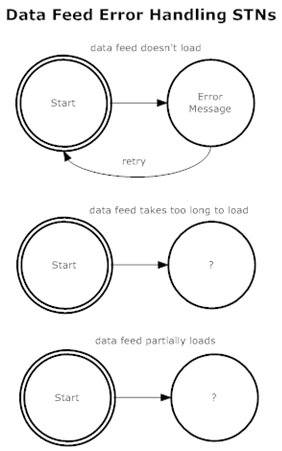
Our bicycle path application assumes that it has a reliable, constant supply of data from a service that describes these paths. Presumably a municipality has a service with these maps available online. If we have explored this option and have deemed it to be suitable, a quick STN can help us explore problem conditions and how we can handle them gracefully in our app. There is nothing worse than pulling out your mobile device when you are away from home, trying to use it to get important, timely information, and having it crash on you. Figure 4 shows my initial work in this area, which raises questions that need to be addressed. With a bit of experimentation, or bouncing ideas off of another team member, we can explore our assumptions and generate ways in which the system can fail, and what our desired program behavior is.

Figure 4: error handling model ideas
Instead of stumbling on all of these combinations through testing and bug fixing, we can be more proactive in our error handling and make early design decisions to mitigate against instability in the app.
It’s easy to get carried away with these and go overboard. I don’t like to spend too much time up-front with speculative design, but a little bit of work can yield a good base from which to work from to help us create our mobile apps. I tend to look at basic workflows and behaviors, and explore possible error conditions in high impact areas of the application. If there are considerations such as network connections, data persistence, user authentication and other needs that require interactions with other systems or servers a bit of creative exploration can help us make better decisions earlier.
Once I have a set of STNs, I or other designers can easily move on to wireframes, visual design and other tasks. Development has more information to help them work on technical design, make decisions on what technology to use, and start thinking about things like data structures and algorithms.
Conclusion
I use these tools in conjunction with other design tools, such as user stories, or use cases (depending on team preferences), wireframes, prototypes and other useful tools. These two are some of the fastest and easiest to get thinking and communication going, and that important product focus that programmers often crave. I’ve been surprised at how effective these two old school design tools are on the latest available mobile hardware platforms. They are quick and easy to develop and communicate to team members with, and help us rapidly drive out ambiguity.
This design work isn’t perfect, and don’t expect to do it all up-front or get it right all the time. I tend to revisit and adjust designs with other team members as the reality of coding and graphic design uncovers more hidden assumptions, but it can save time and effort by quickly exploring areas that can help us focus and make the most of our programming time. It can be expensive to develop, iterate and rework on a vague product idea, without details on states and behaviors. As a teammate once pointed out: there is good a reason program states are studied so much in computer science: many of our programming decisions are influenced by application behavior. The skilled Business Analyst can help our mobile application development efforts by researching and exploring the market, the problem space our teams are addressing, and by providing programmers with concrete ideas that help them move from an abstract product idea to a real product.
Author: Based in Calgary, Alberta, Canada, Jonathan Kohl is the founder and principal software consultant of Kohl Concepts, Inc. Lately he has been working on mobile application development in various roles, on simple speculative apps all the way up to medical apps. Jonathan also helps companies define and implement their product vision, coaches practitioners as they develop software on teams, and works with leaders helping them define and implement their strategic vision. Jonathan is also a popular author and speaker on various software topics.. Contact Jonathan at http://www.kohl.ca/.
iGause, Donald. Weinberg, Gerald. 1989. Exploring Requirements, Quality Before Design Dorset House Publishing Co., Inc. New York. Chapter 6, pp 59-67.
iiDix, Alan. Finlay, Janet. Abowd, Gregory. Beale, Russell. 1993, 2004. Human Computer Interaction 3rd Ed. Pearson Education Essex, England pp. 549-559
Article Phone © Scanrail - Fotolia.com