There are big differences between data exploration versus data presentation. And you need to be aware of these differences as you're creating data stories and data presentations. Let’s start by defining our terms:
Your toolbox for data exploration tools is flush with technology solutions such as Tableau, PowerBI, Looker, and Qlik. "Visual analytics" tools give analysts a super-powered version of Excel for dicing data to facilitate the search for valuable insights. Flexibility and breadth of features is critical; the user needs to handle lots of data sources and doesn’t know in which direction she will go with the analysis.
Data presentation is a different class of problem with distinct use cases, goals, and audience needs. Think about the incredible data stories delivered by the The Upshot, Fivethirtyeight, and Bloomberg. These data journalists often demonstrate data presentation at its finest, complete with guided storytelling, compelling visuals, and thoughtful text descriptions. When compared to these examples, it becomes obvious that the best efforts by a data exploration tool cannot deliver high-quality data presentation.
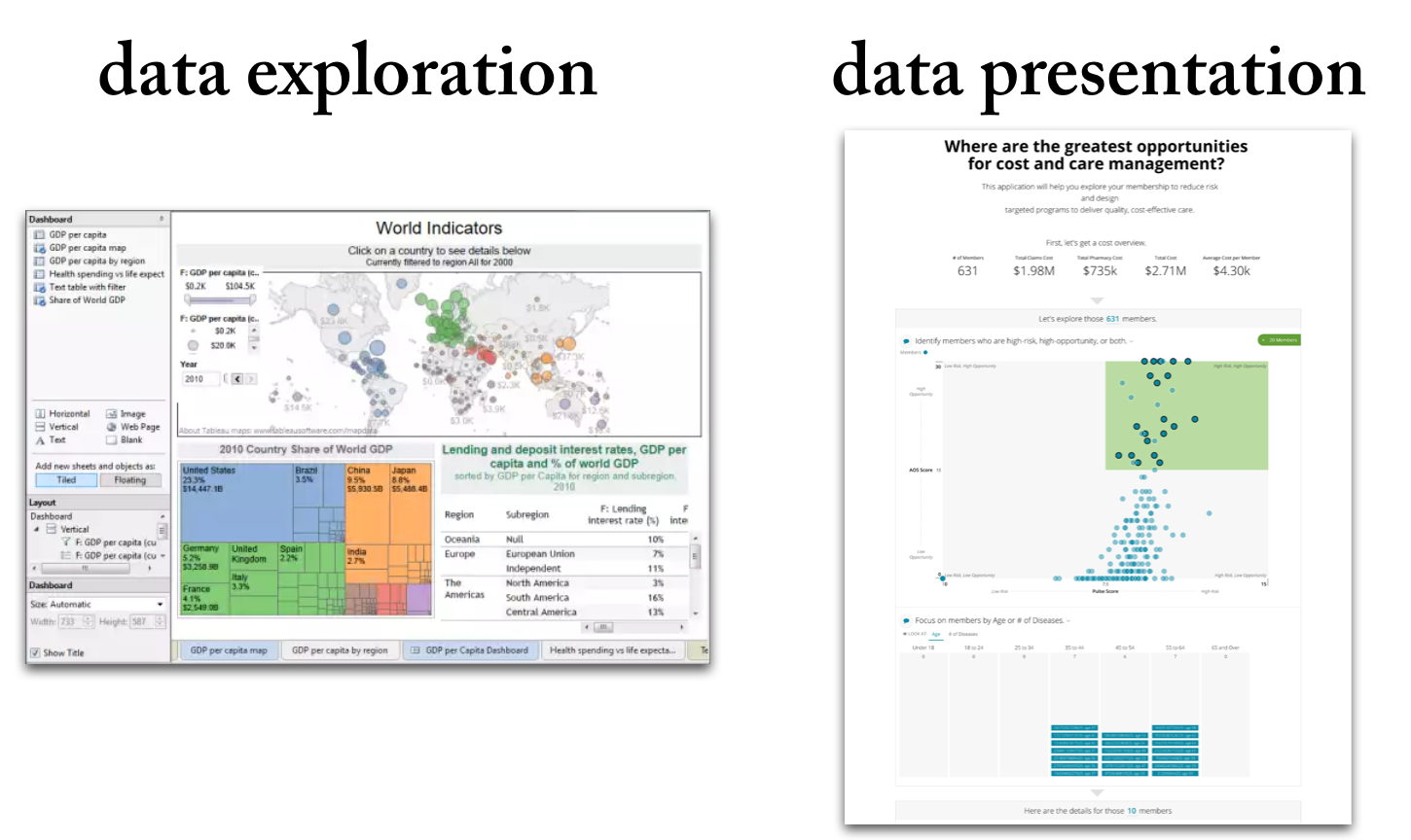
You need a specialized solution if you really want to communicate data in ways that engage your audience. To understand the differences between data exploration and data presentation tools, let me offer six key ways that the activities are fundamentally different.
1. Audience — Who is the data for?
For data exploration, the primary audience is the data analyst herself. She is the person who is both manipulating the data and seeing the results. She needs to work with tight feedback cycles of defining hypotheses, analyzing data, and visualizing results.
For data presentation, the audience is a separate group of end-users, not the author of the analysis. These end-users are often non-analytical, they are on the front-lines of business decision-making, and may difficulty connecting the dots between an analysis and the implications for their job.

2. Message — What do you want to say?
Data exploration is about the journey to find a message in your data. The analyst is trying to put together the pieces of a puzzle.
Data presentation is about sharing the solved puzzle with people who can take action on the insights. Authors of data presentations need to guide an audience through the content with a purpose and point of view.

3. Explanation — What does the data mean?
For the analysts using data exploration tools, the meaning of their analysis can be self-evident. A 1% jump in your conversion metric may represent a big change that changes your marketing tactics. The important challenge for the analysts is to answer why is this happening.
Data presentations carry a heavier burden in explaining the results of analysis. When the audience isn’t as familiar with the data, the data presentation author needs to start with more basic descriptions and context. How do we measure the conversion metric? Is a 1% change a big deal or not? What is the business impact of this change?
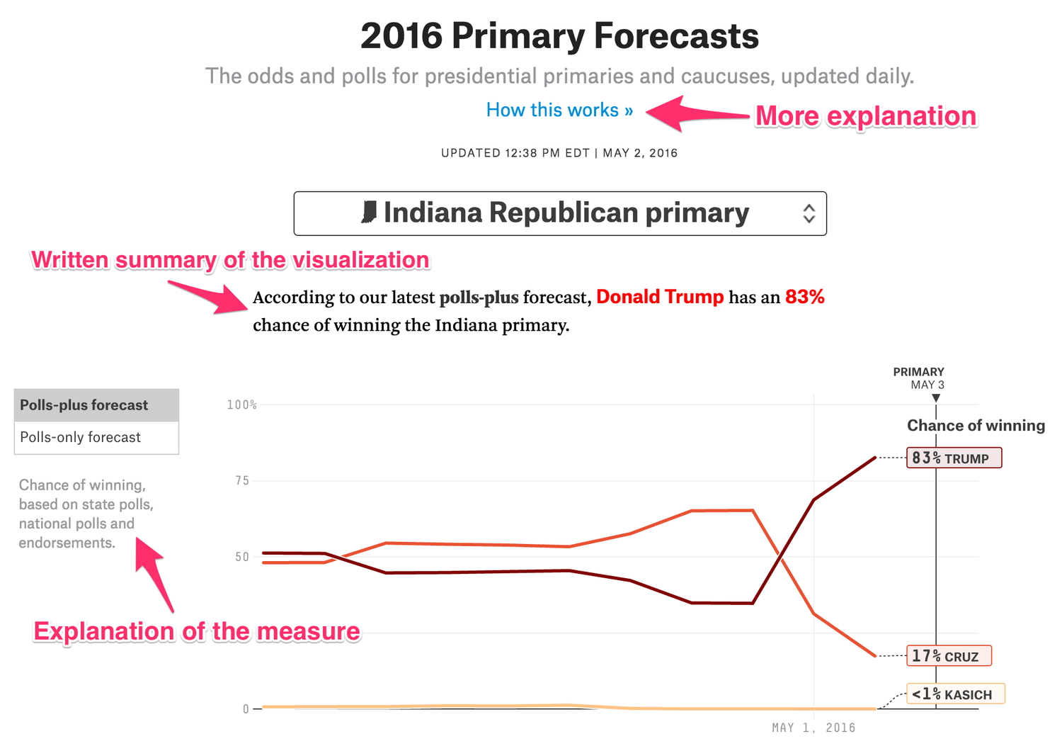
4. Visualizations — How do I show the data?
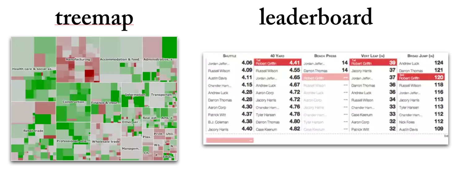
The visualizations for data exploration need to be easy to create and may often show multiple dimensions to unearth complex patterns.
For data presentation, it is important that visualizations be simple and intuitive. The audience doesn’t have the patience to decipher the meaning of a chart. I used to love presenting data in treemaps but found that as a visualization it could seldom stand-alone without a two-minute tutorial to teach new users how to read the content.
5. Goal — What should I do about the insights?
The goal of data exploration is often to ask a better question. The process of finding better questions gets to new insights and a better understanding of how your business works.
Data presentations are about guiding decision-makers to make smarter choices. Much of the learning (through data exploration) should be done, leaving the equally difficult task of communicating the insights and the actions that should result.
In all these ways, data exploration and data presentation are different beasts. This is why we’ve chosen to focus on building the best possible data presentation tool, Juicebox.
6. Interactions — How are data insights created and shared?
Data exploration can be a lonely endeavor: Analysts work on their own to gather data, connect data across silos, and dig into the data to find insights. Data exploration is often a solitary activity that only connects with other people when insights are found and need to be shared. That is, when…
Data presentation is a collaborative, social activity. The value emerges when insights found in data are shared with people who understand the context of the business. The dialogue that emerges is the point, not a failure of the analysis.
Finding the Middle Ground: Data Storytelling
There is something between the extreme ends of data exploration and data presentation. We believe data storytelling lies in this intersection. Data stories aren’t entirely about “telling”, nor are they in the wilderness of “finding”. It is the opportunity to explain the data in a guided, narrative way where message meets exploration.
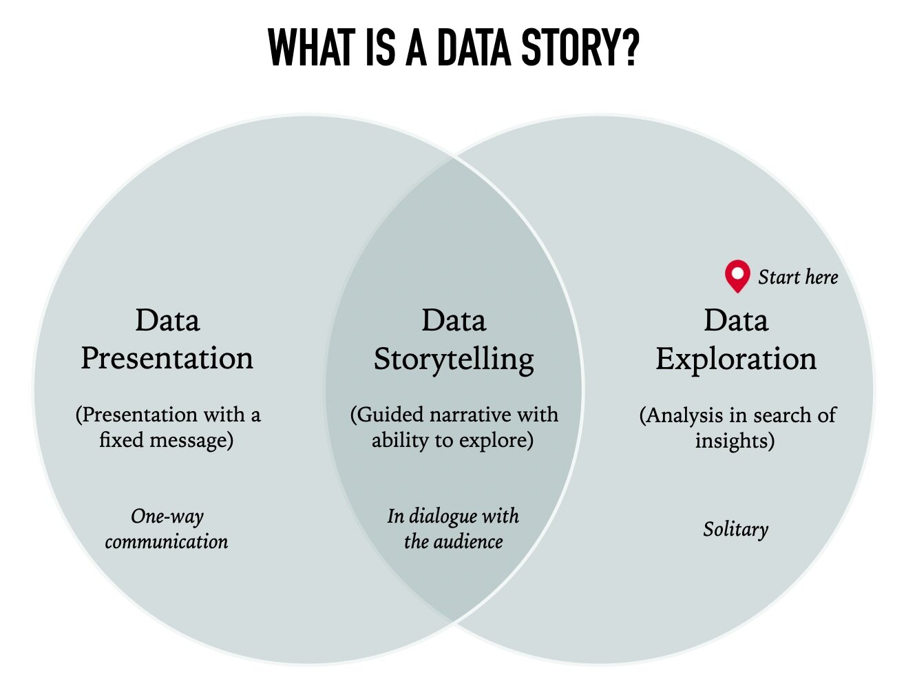
While there are tools for exploration (e.g. Tableau) and tools for presentation (e.g. PowerPoint), it is only recently that you’ve had the change to bring both together in one solution.
Zach Gemignani ([email protected])
CEO, co-founder, author at Juice Analytics
www.juiceanalytics.com